Friday 18 May 2012

Art in the Digital Age

Nowadays art is not just about putting a brush on canvas, or a pen on paper, or even your traditional type of printing methods. Art can be, and usually is, anything and everything. While I was growing up, I always had this notion of art being so much more traditional. Contemporary art did not appeal to me AT ALL!!! I liked traditional painting and drawing, and that's what I practiced. No doubt helped along by my Dad, who was always saying to me "you've got be your own worst critic". He would look at something and judge it on it's merit of being accurate, lifelike, and representative of what you saw.
Now don't get me wrong, Dad has a very open view of most art - he's quite happy to like a lot of modern art, abstract pieces as well as the more traditional. But he was always one to push, (and rightly so), the idea that knowledge and skill were of utmost importance, and I think this is where I gained my views on art.
But as I've gotten older, and studied different areas of art, I have discovered that it's not just 'traditional' art that appeals to me. There is a lot of contemporary art that I really like, and as I mentioned in my last post, I have recently discovered some very appealing digital art.
Which brings me to my subject for this post. How art these days seems to be so much more accessible. I can sit here and draw a picture on a piece of paper and upload it onto various electronic sources, and people all over the world can see it. And I can get instant feedback and gratification. For an artist that can be satisfying, or it can be terrifying.
Another part of art in the digital age is the editing that can be done to change any picture. Photos can be changed to look like anything we can imagine up. (That opens up a whole separate rant on editing, in particular beauty editing, that I have VERY strong opinions about but won't discuss here in this post!) Paintings and drawings that I might wish just had a little tweak here, or a whole other colour palette, can be changed in an instant. I can then save the files and have them printed out.
Giclee printing is another benefit of the digital age. It has become very acceptable within the artistic community to have an edition of Giclee prints, just as it is to have an edition of etchings, lithographs or linocuts! And screen printing nowadays is also a digital wonder. You can design beautiful and intricate pictures either freehand or in Illustrator or other art programs, and send them straight through online to screen printing companies that will essentially mass produce them for you, for a relatively small cost. The resulting print will still have the look and feel of any other print, and no-one need ever know if you did do it entirely digitally. Of course, maybe you want people to know that you have done it digitally. It is after all, just another medium we have at our disposal these days, for creating beautiful and unique works of art.

Tonight I have been playing around (and I say playing around because I am SUCH an amateur with it!), editing one of my drawings. I love this pen drawing - done with a Faber Castell Pitt Indian Ink pen. But I love the effects I was able to come up with by digitally playing around with them. So much that I am going to have one of them printed as a Giclee edition.

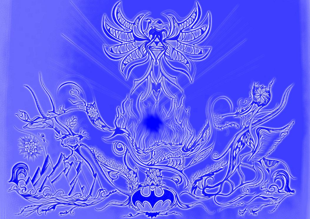
Phoenix rises (along with Stickman!) C. 2010
I think that as our world evolves, the art community, and therefore what is considered art, has to evolve with it. People don't want blase. They want amazing. They want to be moved by what they see. That emotion is different in everybody, and that is one part of art that will never change. The creative process that leads an artist to make something that someone, somewhere will find amazing hasn't changed. That will always remain, no matter how digital we get.

Tuesday 8 May 2012

How to paint an abstracted landscape

The current project we are working on in my painting class is an abstracted landscape. The idea is to take a series of photographs of any landscape, then collage them onto a plain piece of paper. When assembling them together for the collage, we had to decide on the composition, and be sure to 'confuse' the elements. That is, turn some pictures upside down or around the wrong way. We then had to paint the composition and make it work as an abstract piece.

The photographs I chose to use, were some I had taken when I was in Minneapolis for the Christmas/New Year of 2010. There was snow everywhere when I visited, which was something that I had never really seen. I was completely blown away by not just the amount (in some places it was a metre deep!), but the whiteness of it.

I was spending the day hanging out at the music store where Matthew worked because he was rostered on, and thought I'd go exploring for a little bit. So I donned my beanie and gloves, and my awesomely warm jacket (to match my amazingly warm fluffly snow boots!), and prepared to brave the minus 10 degrees celcius or so temperatures outside. The sun was shining and it was really quite lovely to walk around in. I just had to be careful not to slip on any of the ice that was sitting on the cleared sections of path. The sound of the snow crunching under my feet is something that even now, I can hear if I shut my eyes and think about it. I loved it. It was so different and beautiful. So I walked away from the shopping centre and heading towards the frozen lake at the bottom of the carpark.

Frozen Lake at the bottom of Westridge Market Shopping Centre in Minnetonka
My nose became numb pretty quickly, but the rest of me was warm enough. I had my camera and I did have my iPod, but actually didn't listen to it. Instead I listened to the silence. It was amazing. For such a built up suburban location, the lack of noise was astounding. So I listened to the crunching of the snow under my feet, and not a lot else. I don't recall hearing any birds or other animals, and for someone from Australia, who has never been in that kind of environment, the lack of 'other' noise was something to savour.


So back to the art project at hand. I took these and some more of the pictures I took and collaged them into a circular pattern. I used the bare trees and the parallel lines of the timber structure to create a focus: a shape that leads you into the picture and encourages you to stay and look further.

The result is still a work in progress, but I am happy with it so far. I am going to leave it sketchy in style around the edges - I think it fits the picture. The trees and timber are all going to remain in the Burnt Umber that I have started them in, adding in only a little of black to deepen the tone. The white will be coloured with purple and blue to show shadows, but other than that, I am not planning on doing too much else to it. I think it's going to be an interesting picture to look into.

Sunday 6 May 2012

Homework!!

I missed some school last term and being the busy person that I am, managed to not really get any of my catch up school work done over the term break. So now that school is back in, I have homework to do!! So today I spent the morning cleaning up my studio - it had survived the ultimate test last night - being host to eleven 13 year old girls for a slumber party! Thankfully, none of them touched my stuff - probably due to me telling them several times in no uncertain terms, "Don't touch my stuff!!!!" The first thing to be tackled was my journal work. That involved some research on a Sidney Nolan painting - I chose his Gallipoli, 1950 to discuss.
 I love the effect he's created by scraping the paint across the canvas, and I love the colour. I also discussed some of Rene Magritte's work. In particular his Mermaid, 1935 and Intermission, 1928.

I had to talk about how Magritte makes the illogical seem to be the truth. For me, this comes from the toning within the human forms - we know they are human because of the shapes and the shadowing. The paintings are executed in such a manner that the disparate objects within the pictures seem so realistic that our brains simply accept what they are, and where they are. That's my take on it anyway. I do find his work very appealing.
I also included some research on digital art. I included some examples of artist John Sauerhoff's work. His work is printed onto ink embedded paper and the somewhat fantastical effect of the colours is very visually stimulating. 

You can find other examples of his work here: JVS Tree Illustrations

Lastly I had to find a few examples of Pop Art and draw some. I was fortunate enough almost two years ago to see an exhibition on Pop Art at the Walker Art Centre in Minneapolis. To see Andy Warhol and Roy Lichtenstein works in person, among others, was truly an amazing experience! Pop Art is such an important part of our artistic history, no matter what anyone personally thinks of the work, it was so exciting to see some of them in reality as opposed to on a screen or in a book. I ended up drawing a Jasper Johns Flag, (an example of which I also saw in the flesh so to speak!), and an untitled Frank Stella work from 1964.

Now all that's left to do is finish up my Arts and Business mountain of paperwork, make a new sculpture and draw it multiple times for my drawing class, then take photos of it and play around with it in Photoshop. I also have to finish my transcription (remember my Theorbo Player?), finish the new painting I started last week (more on that in my next post!), finish etching my Shellac plate and make three prints from it, and begin on my copperplate etching this week! And then next week we start on ANOTHER painting, and I need to begin work on my history essay!! Good thing I like being busy!!